How Artists Make Pictures
Yesterday, my brother, Ashley, shared how he comes up with ideas and brings them to life in children’s books. He shared that he knows how to figure out what words to use and what order those words should appear, but how has no idea how to create illustrations.
There are several parts to creating images that tell a story.
First, the illustrator needs to get a feel and understanding of the story and think about the most important and interesting parts to bring to life through an image. An illustrator isn’t going to draw EVERY SINGLE THING that the author wrote. Their job is to capture the feeling and meaning of the words on the page in an image.
Illustrators are thinking about visual communication. You “read” images around you every day without even thinking about it. Road signs, packaging, advertisements and so much more are telling you a story through color, line, shape, and font choice. Artists use the elements and principals of design as their language to tell a story.
To help you understand, let’s look at some examples.

In this example, the author, in this case, Ashley Sollenberger, writes the text and sends it to the illustrator, me. I start by reading the text and then need to make a few decisions.
- What is the most important part of writing, and how does that turn into an image?
- How do the text (where it’s placed on the page) and the image relate to each other?
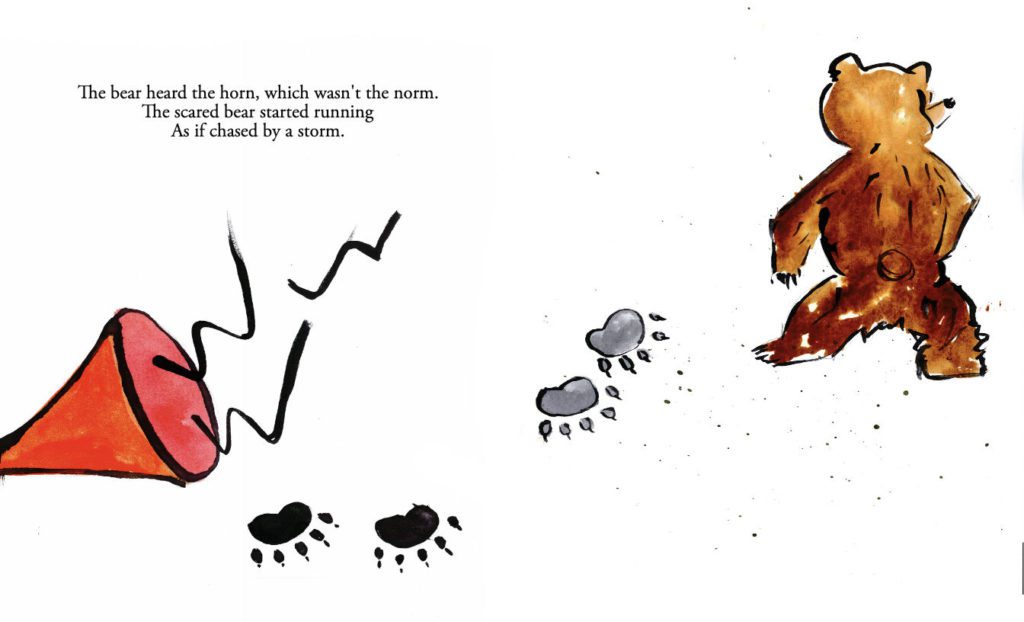
Above you see I decided that the horn and the bear were the most important parts. The text tells us that the horn scared the bear (so it happened first), and caused the bear to run. That is why the horn is placed on the left front and bear on the right towards the back. We read written text from left to right, and do the same with visual images. When looking at images, objects closer to the front of the page seem closer to us, so moving the bear towards the back, helps to imply movement.
This is one of the first drafts of the image, so I’ll also think about what might need to change to make it better connect with the text. The horn should move farther towards the bottom left, and the bear prints should face the other direction, to give a better sense of movement.
Artists also have a lot of decisions to make about color (element of art). They can choose to make things the “real” color, or make up their own color scheme. In the above image, the horn is red/orange, as we tend to think of those colors when we think of warnings. I choose to make the bear a brown bear instead of a black bear because we often think of the color black as being scary, and this story isn’t meant to be scary, so I went with a brown bear.
Just like when you write you create several drafts, the same thing happens when creating visual images. That’s one of the reasons that many artists work in sketchbooks.

Let’s look at another example.
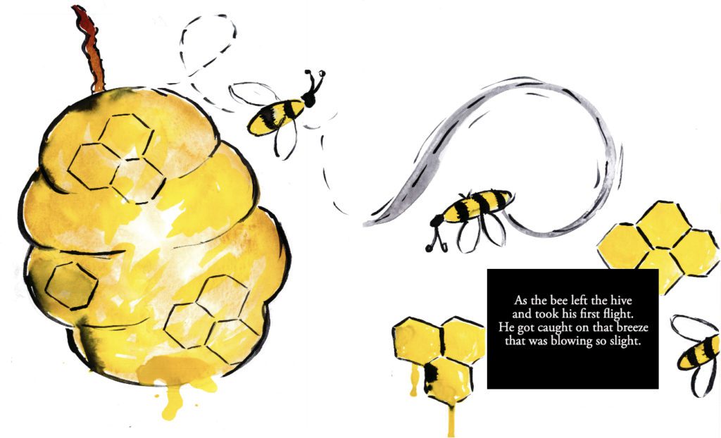
Here you can see the idea of movement (principal of art) happening again by having the bee travel from left to right. A dotted line (element of art), curved line, and repeated the bee 3 times is used to help imply movement. Another technique the artists use to imply movement is to have images going off of the page, it helps the viewer, understand that there is a lot of space (element of art) for the subject to move. In a book, it also helps to tell the reader to turn to the next page to see where the subject ends up next. That’s also why the text on this page is on the bottom right, it’s designed to make the reader turn the page and follow the bee.
Repetition (principal of art), is another common tool that artists use to help you know how to move your eye through the image. There are several kinds of repetition in this image. Color (element of art) and Shape (element of art) are both repeated.

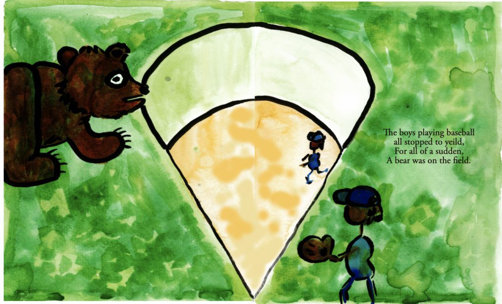
Let’s look at one more draft together. This one uses another principle of art ( Scale). Scale is when an artist thinks about how each object in an image work together to help the viewer understand the size. Writers use words to exaggerate and artists can use scale to do the same thing.
We know that bears are bigger than people, we also know, that when we feel afraid of something, we often imagine it has much larger than it really is. Here the bear is almost as BIG as the baseball field.
There are a few things happening that help to imply movement, that the bear is moving across the field towards the baseball players, can you tell what they are?
- We only see half of the bear, remember, when an image runs off of the edge of the page, that is a helpful way to imply movement.
- The text is on the opposite side of the bear. And since we read left to right, you’ll first look at the bear, move in the direction of the baseball field and then move to the text. This makes it feel like the bear is moving as your eyes move across the page.
Artists spend time studying and practicing using the elements and principals of art so that they can communicate visually with you.
Just like we learn to read and write words, we can also learn to read and draw images through intentional learning and practice.
Watch this video to see an example of how Artist Jacob Lawrence uses the elements and principals in his work.