The Language of Art
“Art can help anyone anywhere fix things because it is a universal language. Two people from completely different backgrounds with opposing viewpoints on everything can stand in front of the same image and discuss what they see.” Fixed p 7
A large part of studying Art History is studying the language of artists. You’re learning what parts of the visual language remained the same over centuries and what “slang” artists bring into their work.
It is important to remember that when “reading” a work of art, your cultural context influences how you read and react to it. The same goes for the artists who created it. Their life experiences play a role in the overall meaning of the work.
In the book Fixed, Author Amy E. Herman shares three important things that looking at art can do.
“Looking at art and talking about your reactions to it provides a neutral ground to express your feelings and personality.”
“Art poses puzzles and problems while presenting a viewer with fresh mysteries.”
Art provides a way for the mind to make new connections, to make leaps and engage in a different kind of thinking, both individually and collaboratively, that is new, revitalizing, and refreshing.” p29-30
When you’re first practicing looking at and talking about art, start using the language you already know and describe what you see in as much detail as possible.
Example:
Look at: Direct Response, painted by Jordan Casteel.
A black man is sitting on a bench; it looks like on a subway. His back is up against the corner, and he’s somewhat slouched; his eyes are closed, hands clasped and resting on his lap.
He’s wearing grey pants; they look like jeans and an orange work coat. The coat appears heavy, and the hood is pulled up over his head. The jacket also has silver reflective strips, and the bottom third is a charcoal grey color. The strap of what looks like a black backpack is around one arm, and there is an orange hat on top of the backpack with the letters WD and one more that I can’t make out.
The bench seat is orange, as is the wall. Most of the painting is orange and grey. There are reflections of the orange in his pants. There is a poster on the wall with a drawing of a TV made to look like a cartoon with arms, legs, and a head, with words that read PRO (the O in the shape of a TV) Media. The top line reads, “if we are not buying, we are dying” Another line, “direct response” The other words that I can see say, if you spend time on television… other words are blocked by the figure.
There are hints of purple in his skin and what looks like a panel for a heater below the bench seat.
When you’re describing a work of art, pretend that you’re trying to help someone imagine what it looks like if they can’t see it. You’re observing the language of the artists. After describing what you see, start to look at how the artists used the elements and principles of art and begin to make a hypothesis about what they wanted to communicate. (It’s important to note that not all works of art have a deep meaning).
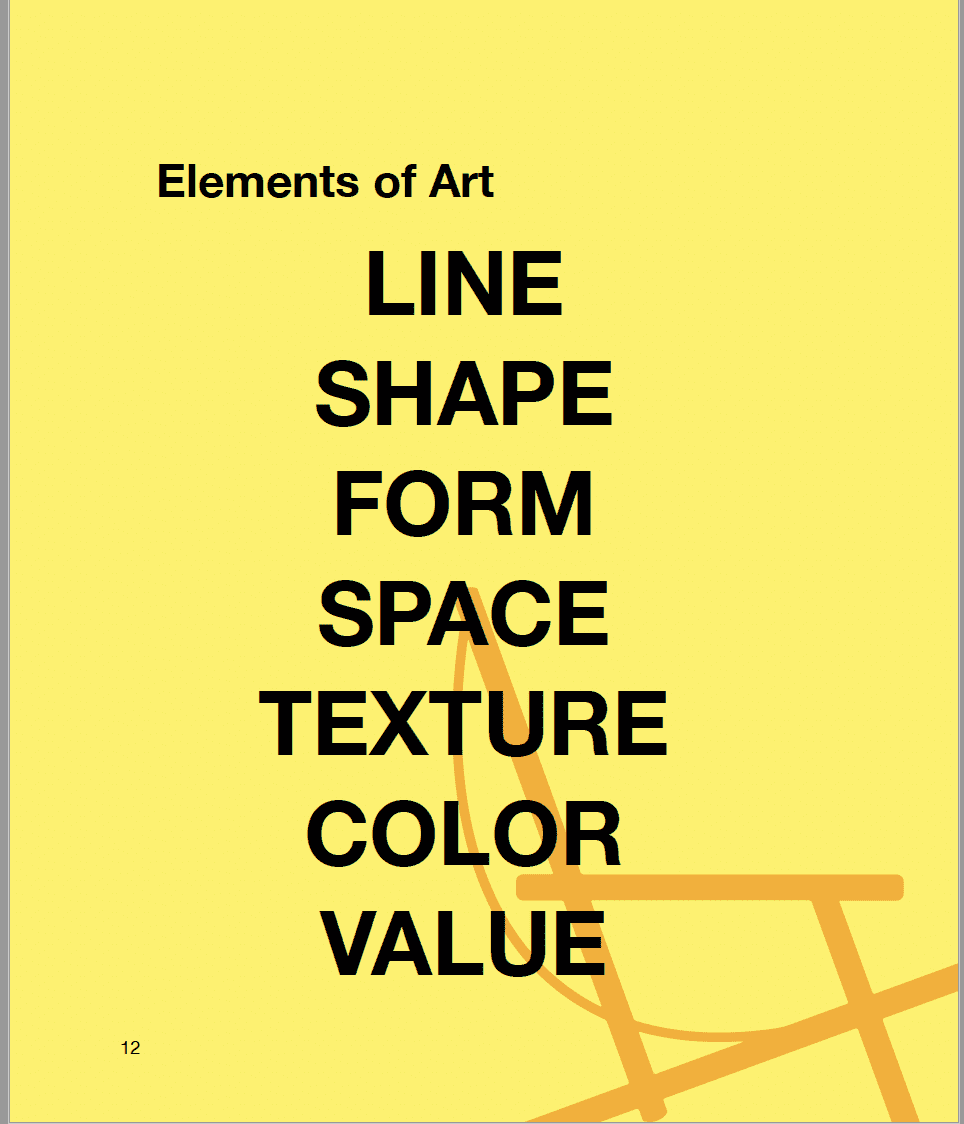
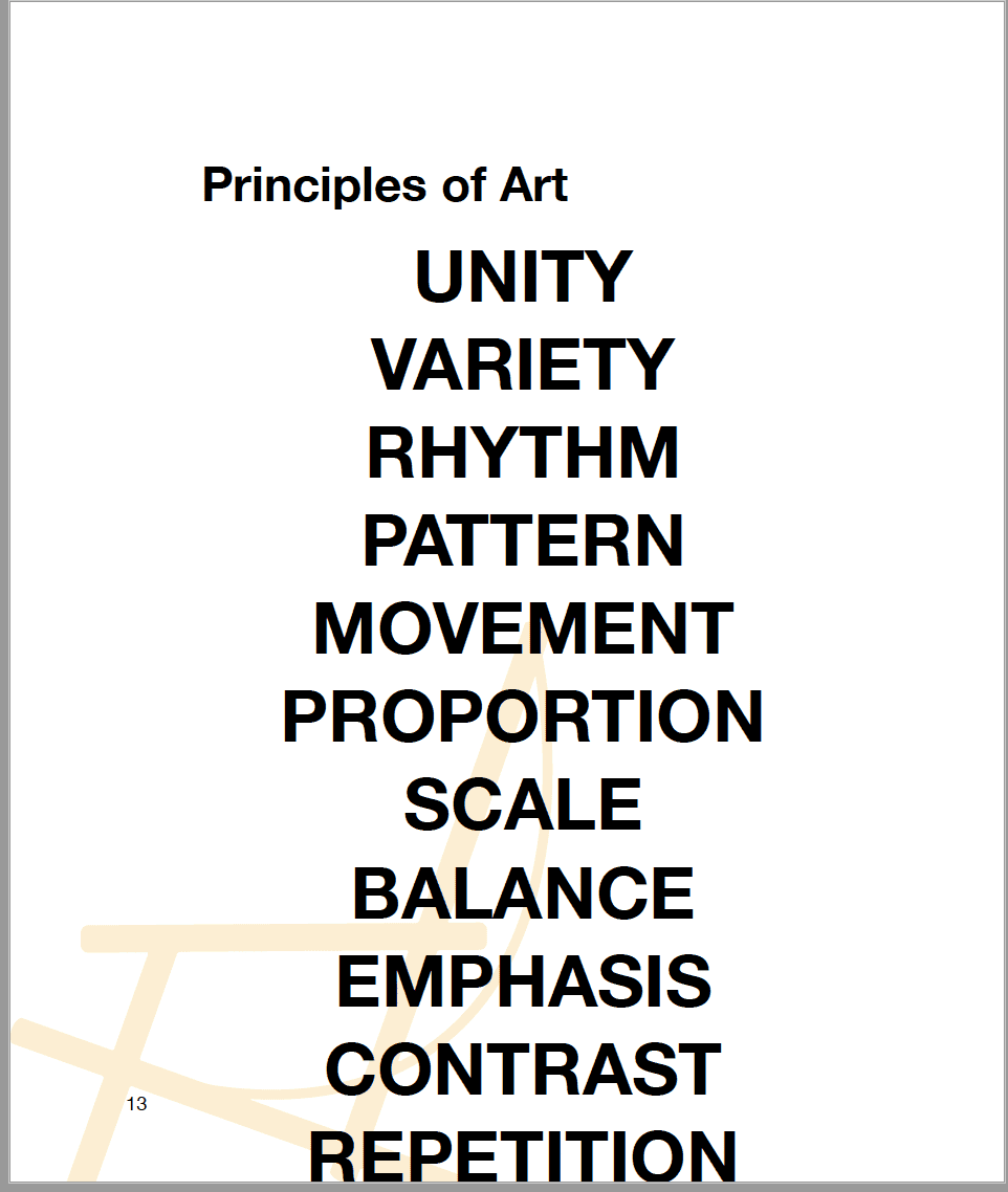
Artists use the elements and principles of art to create a composition. The elements of art form the principles.
Let’s look at the description that I wrote about, “Direct Response,” and identify where I’ve mentioned things that are elements or principles.
A black man is sitting on a bench; it looks like on a subway. His back is up against the corner [principal: emphasis], and he’s somewhat slouched; his eyes are closed, hands clasped and resting on his lap.
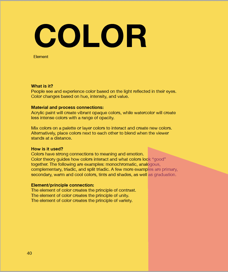
He’s wearing grey [ element: color] pants; they look like jeans and an orange [element: color] work coat. The coat appears heavy, and the hood is pulled up over his head. The jacket also has silver [element: color] reflective strips, and the bottom third [ principal: pattern] is charcoal grey [element: color]. The strap of what looks like a black [element: color] backpack [element: shape] is around one arm, and there is an orange [element: color] hat [element: form] on top of the backpack with the letters WD [principal: pattern] and one more that I can’t make out.
The bench seat [element: form] is orange, as is the wall. Most of the painting is orange and grey. [principal unity] There are reflections of the orange in his pants [principal: unity]. There is a poster on the wall with a drawing of a TV made to look like a cartoon with arms, legs, and a head, with words that read PRO (the O in the shape of a TV) Media. The top line reads, “if we are not buying, we are dying” Another line, “direct response” The other words that I can see say, if you spend time on television… other words are blocked by the figure.
There are hints of purple [element: color… paired with the color orange = principal: contrast] in his skin and what looks like a panel for a heater below the bench seat.
As I worked to annotate the elements and principles, I realized what I observed in the painting but didn’t capture in my first description.
The background has dry brushstrokes [element: texture] and is much less finished or refined than the figure [principal: contrast & emphasis]. The figure’s clothes and skin appear smooth and almost silky. [element: texture] The figure occupies most of the painting, his legs run off the front of the page, the tip of his hood almost touching the top. [principal: scale].
I haven’t highlighted every element and principle that you see in the painting. When you do this exercise for the first time, it may help you break things down into basic shapes. For example, the figure is a shape, and the backpack, poster, and bench are shapes/forms.
Now that you’ve identified elements and principles, it’s time to think about why the artist made those choices.
- The figure occupies most of the painting; his legs run off the front of the page, the tip of his hood almost touching the top. [principal: scale]. This puts the focus on the figure; you can’t miss him. The painting is 72″x56″, which means that when a viewer is looking at the painting, it’s taking up more space than they are. The artist uses scale within the painting and the size of the painting itself to force the viewer to SEE the figure.
- There are hints of purple [element: color… paired with the color orange = principal: contrast] in his skin and what looks like a panel for a heater below the bench seat. Orange is a warm, bold color that grabs our attention. Many people connect the color orange with manual labor jobs. We also understand that the color orange can indicate possible danger—Orange, paired with purple with orange, pops even more. Once again, making the painting hard to ignore.
- A black man is sitting on a bench; it looks like on a subway. His back is up against the corner [principal: emphasis], and he’s somewhat slouched; his eyes are closed, hands clasped and resting on his lap. By placing the figure in the corner, he’s framed by the wall and the bench; this natural frame pushes the viewer’s attention to stay focused on the figure and not wander off the edge of the painting.
As with any other language or skill, learning to read works of art takes time and practice. Pick another work of art that you enjoy, and practice describing it and identifying elements and principles of art.