How to Illustrate Text
Author of Fixed, Amy Herman talks about the need to start with a draft whenever you’re trying to solve a problem. ” Problem-solving, like creating art, involves making a coherent narrative out of materials- or information- that one has gathered. The artist may begin with nothing more than raw materials, but the process quickly turns into putting those materials together in a way that conveys meaning. It’s the process of creating order from disorder. This is the stage where the artists begins drafting.”
Often, problem-solving is viewed with two narrow of a scope. We think of problems as negative things that only need solving because we need them to go away, or we need to find the answer to pass the test. If you only view problem-solving as a negative thing, you’re missing out on all of the fun.
You’re solving a problem when:
- You’re deciding what to wear each day.
- When you’re thinking about how to get more followers on Tik Tok
- When you’re trying to get out of cleaning your room.
You’re also problem-solving when:
- You’re coming up with an idea for a new artwork
- You’re developing the topic for your English paper
- You’re writing a business plan
When children’s book author, Ashley Sollenberger, hands me a draft of the text for a book, I have to solve the problem of how to translate the text into images.
I’m thinking about:
- Where do the pages need to break?
- What should a spread look like?
- What are the key parts of the text that should turn into an image?
- How do I capture the essence of the text without illustrating each word?
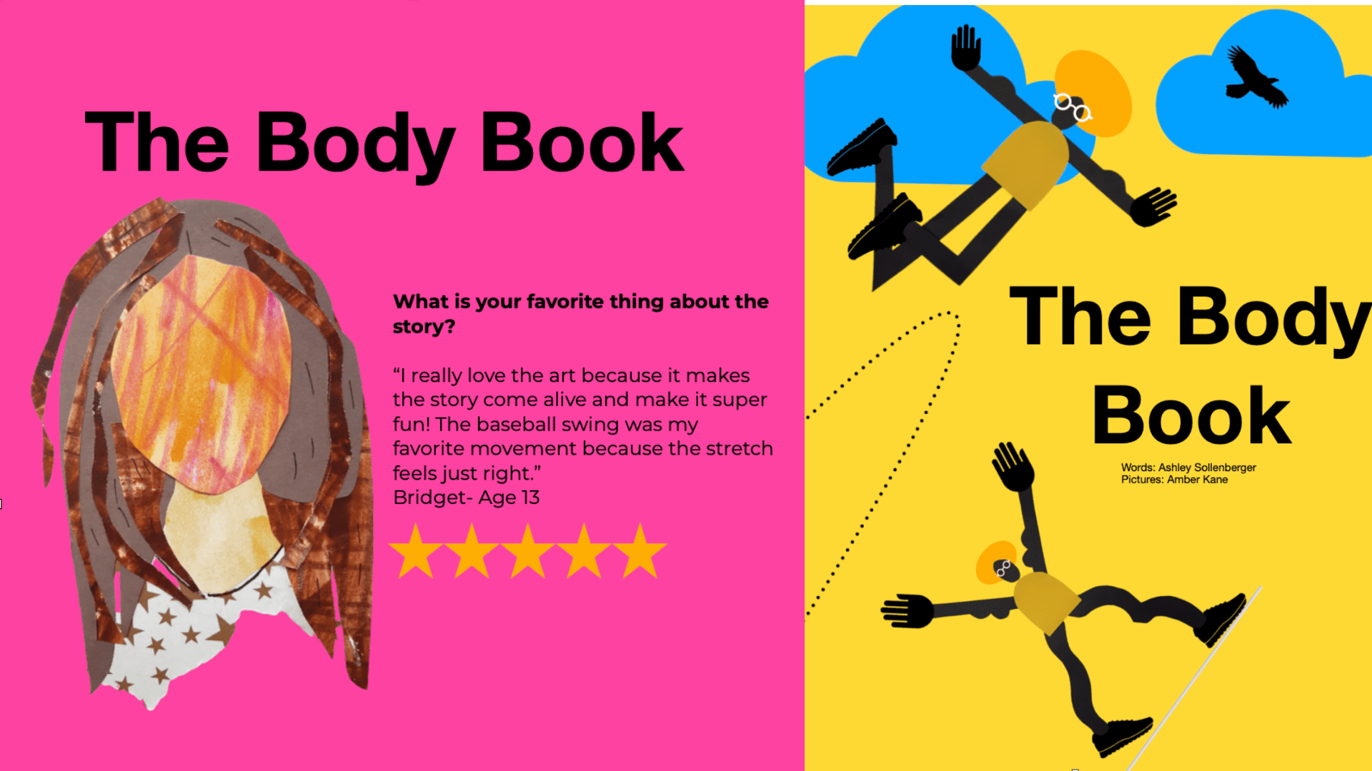
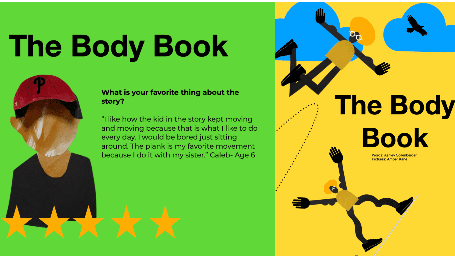
Here’s an example. Ashley emailed me the first draft of The Body Book. While his ideas tend to start as lines scribbled on notecards, I don’t see the story until it’s typed into a Word doc.
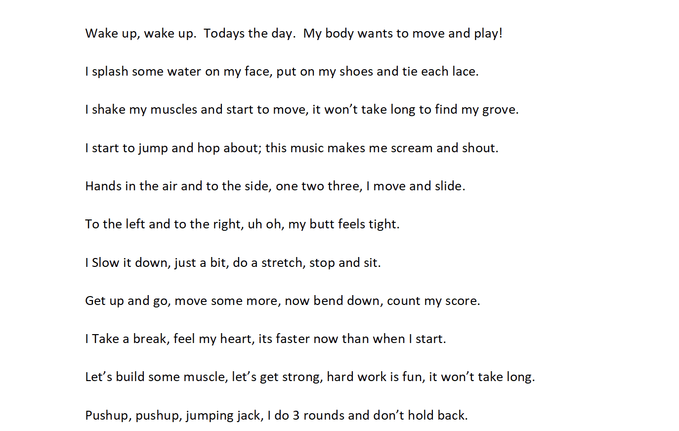
It’s time to determine the page breaks. I’m thinking about what a spread ( a spread is the pages that are side by side) will look like. The spreads need to look like they go together, and should encourage you to want to explore what’s on the next page. As I determine the pages breaks, I begin to image and make notes of what the images might look like.
Here’s what that looks like…
Amy Herman continues to say, “While each discipline demands its own specific drafting process-filmmakers storyboard, writers might outline, painters sketch, designers might sew a muslin mockup- the artist begins with a rough draft. Ultimately, a rough draft will be honed into the final work, but the iterative process is key to a successful rendering of any work.” ~ Fixed, p.134
Every artist has their process for developing and implementing ideas; I encourage you to reflect on your problem-solving process. For me, constraints are always involved. No matter what I’m working on, my materials drive my process and ideas. When creating illustrations, I start by looking through the piles and piles of paper that I’ve collected, made, and purchased over the years. I look and experiment until something finally seems right.
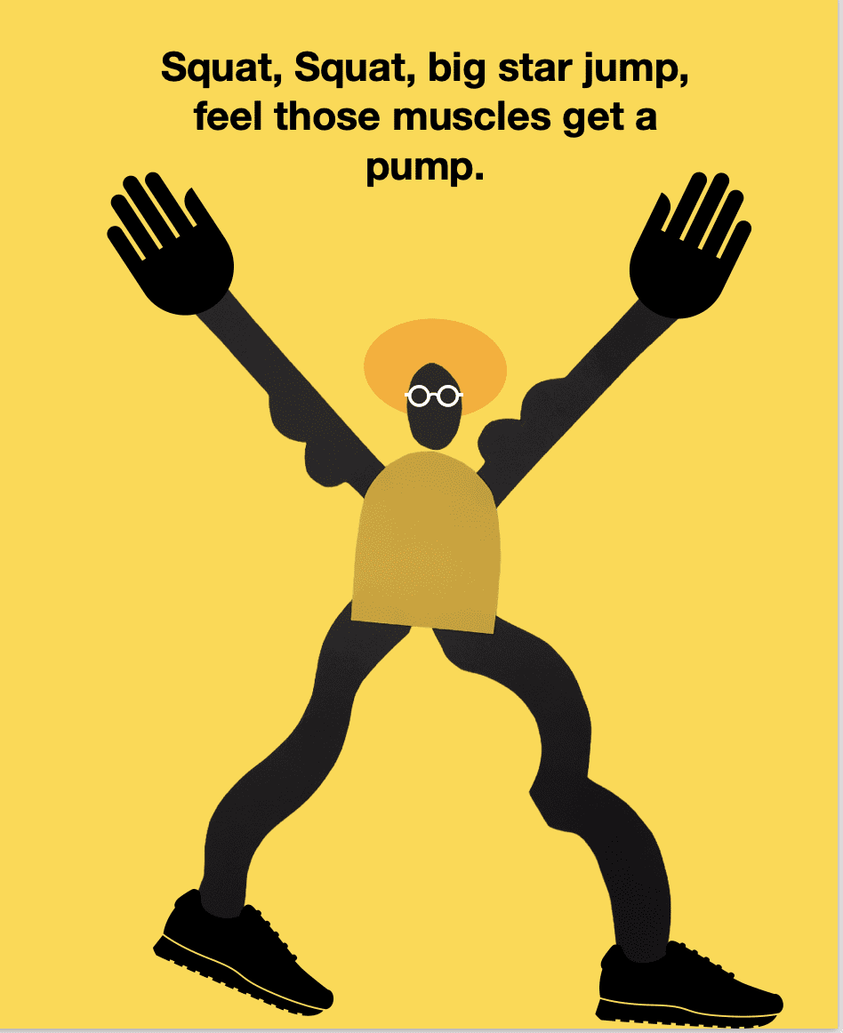
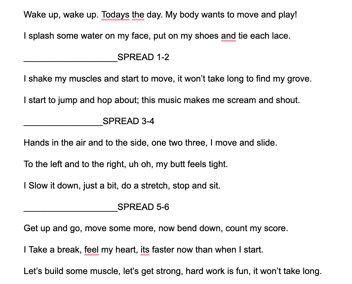
As I started on The Body Book, there were two piles of black and yellow construction paper left over from an art project for How the Bear Met the Bee. Those were going to be my primary materials. The essence of The Body Book is about the importance of movement and all that it brings to our lives, so while I knew that I needed a figure, I didn’t want it to be about THE FIGURE; I wanted it to be about the movement.
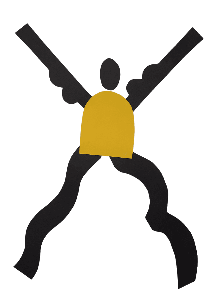
I’d been thinking about how artist Henri Matisse created cut paper collages late in his career, grabbed a pair of scissors, my paper, and started to cut play shapes that resembled body parts. Once surrounded by legs, arms, and heads, I realized that I needed to begin to put them together.
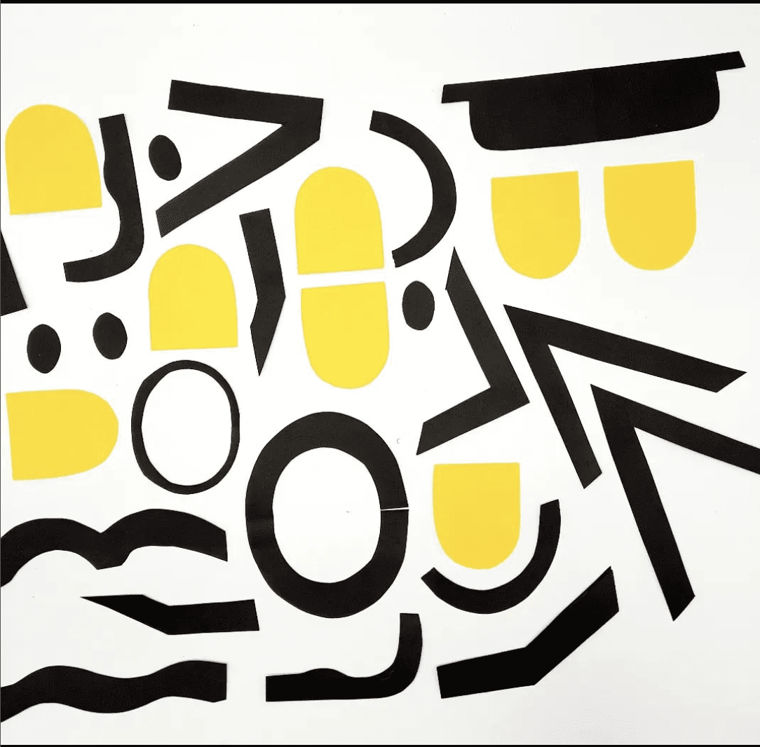
Once the basic figure took shape, I upload it onto my computer and add the details like hands, feet, hair and glasses.
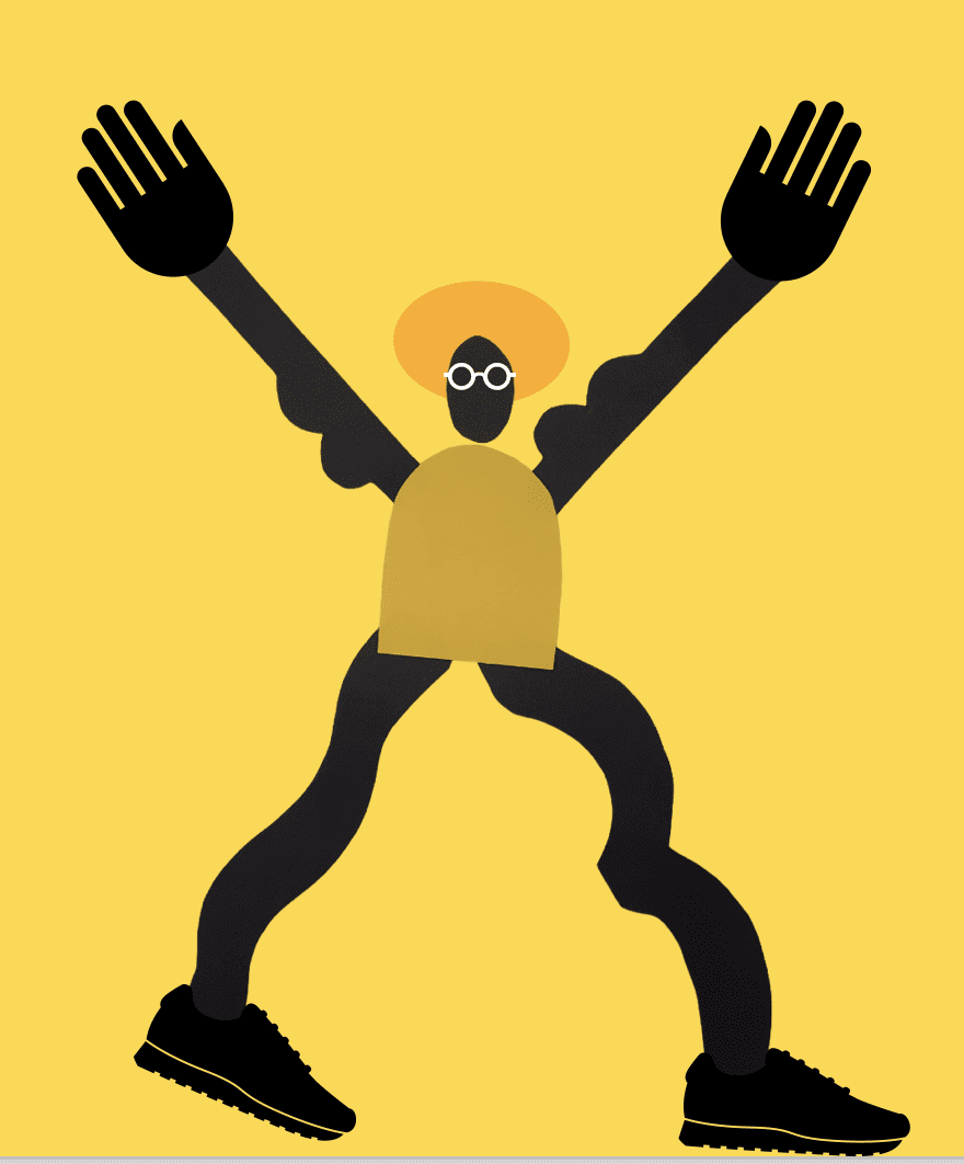
The final step is adding the text, and while that may seem simple, there are still many decisions. You need to decide font type, color, size, and placement. I choose a sans serif font as it’s less formal and easier to read. The text is large, since it’s a children’s book, and is either black or white depending on the color of the background. Most research recommends that children’s book font is between 16-24, so that’s what I aim for.