Reading Images
Do you know how many images you see in a day?
Do you realize that you regularly read and interpret visuals?
Artists and designers use the elements and principles of art and design as a language to communicate visually.
Whether you have spent years studying visual literacy or don’t even know what it is, you’ve been developing your ability to read visual images your entire life.
Shapes, colors, and lines surround you.
Those elements form images, patterns, and sometimes, even words.
If you have grown up in the United States, you know that red means to stop and green means to go. Blue reminds you of the sky and the ocean.
An octagon makes you think of stopping, a circle makes you smile, and repeated patterns give you a sense of calm.
Images aren’t limited to pictures hanging on the walls of museums, they’re signs, diagrams, billboards, and book covers, images are everywhere. Images, help us to remember.
How do you determine what mark, shape, line, or color to put on a page, and where to put it to communicate your idea?
How do you look at an image and interpret the meaning?
If you feel like it’s hard to confidently read a work of art, or create a piece that communicates, don’t feel bad; like any other language, you need to learn how to “read” and “write.”

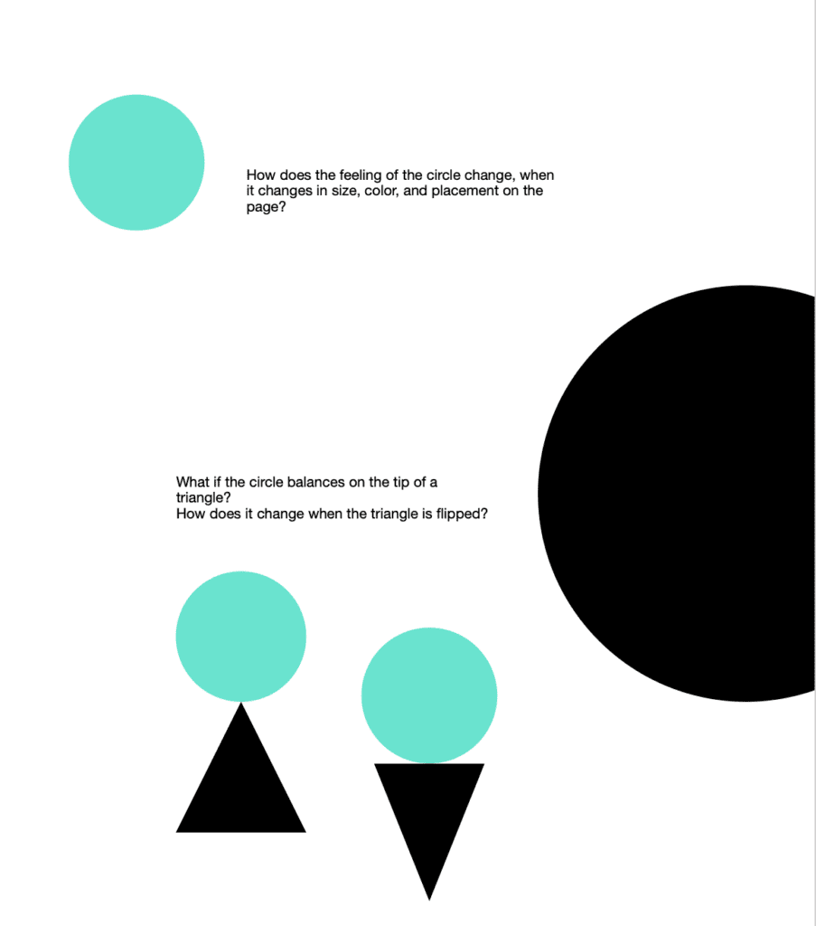
Let’s give this a try. If I were to show you a circle and ask you to connect it to an emotion, you likely selected a joyful emotion. If, in contrast, I showed you a triangle, you would probably select something more powerful. You might not know why.
A circle has all round edges, making it feel safe. Circles also remind us of things like balloons, balls, and wide baby eyes. In contrast, triangles have straight lines that come to a point. If we tripped into the edge of the triangle, we would likely hurt ourselves. Triangles also remind us of roofs, treetops, and knives, all things that if used in the wrong way, could cause us harm.

Elements and Principles
The elements and principles are foundational tools to help artists and creators make decisions. There are no rules for what elements and principles to use, or when a creator has to use them. The elements and principles are an artist’s vocabulary. Just as a writer needs individual letters to form words, words make sentences, and sentences make paragraphs, artists use the elements and principles as building blocks of communication.
The elements are like letters.
Principles are equal to sentences.
Combining the elements and principles equals a composition.
It’s essential to know what the elements and principles are and how they convey meaning to start to use them in your work or to interpret the visuals that surround you.
The elements of art are: line, shape, form, space, texture, color, and value. Artists use the elements to create principles. Principles are unity, variety, rhythm, pattern, movement, proportion, scale, balance, emphasis, contrast, and repetition.
One of the best ways to start to strengthen your visual literacy skills is to look at images and reflect on what you see, and how it conveys ideas and emotions.
Give it a try and watch the video below. The video shows you a picture book where all of the text has been removed.
- What do you see?
- What colors and shapes do you see?
- What do you think the story is about and what makes you think that?
Want to find out if you’re right? Head over to Reading Tree Publishing to find out more about the book.
You don’t need to be an artist to be visually literate, just as you don’t have to be a writer to know how to, and, benefit from reading. Look around. You probably see images, lines, colors and shapes everywhere, what are they telling you?